Introduction
One of the most common requests I get from students in my Portfolio & Career Prep lab at ArtCenter is how to add hover states to Thumbnail Indexes in Cargo.
Designers want to be able to display the project title and sometimes the tags over the thumbnail image and / or replace the thumbnail with an animated GIF.
Let’s walk through how to do this with some simple CSS!
If you’re more of a visual person, check out the walkthrough on YouTube below below and grab the final code from GitHub.
Setting Up the Cargo Site
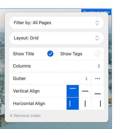
I started fresh and created a brand new Cargo 3 website using the C973 template and added some images from Unsplash as the project thumbnails. Then I checked the “Show Title” option on the Thumbnail Index.
In Cargo there are two different places you can add your own CSS. You can either use the sitewide CSS editor, which will apply your styles across the entire website, or you can use the page-specific CSS editor, which will only target the current page.
I’ll be working in the page-specific CSS editor but most of the code can be reused if you want to apply the CSS site wide.
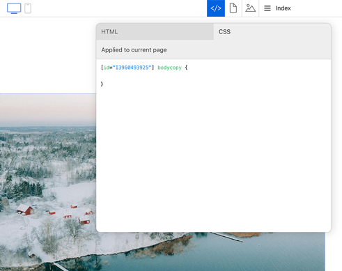
The [id="1234"] number will be specific to your site. You’ll need to prepend all your CSS declarations with this (but only to keep the code scoped to your homepage thumbnail index). Watch the screenshare to see this in context. I’ll be leaving off the prefix for the rest of the article.
Applying The CSS
Targeting the Thumbnail Elements
First I need to identify the specific CSS classes and elements that make up the thumbnail index layout. By inspecting the page source in the browser’s developer tools, I can see that each thumbnail is wrapped in an element with the class thumbnail and linked. This will be the primary selector in my CSS code.
I’ll start by adding some basic positioning and overflow styles to the container:
.thumbnail.linked {
  position: relative;
  overflow: hidden;
}
Setting position: relative on the thumbnail container will allow me to position child elements absolutely within it. And overflow: hidden will ensure any content that extends beyond the thumbnail dimensions is hidden
If CSS positioning is new to you, I actually recommend checking out Webflow’s video on the topic. Even though the video is specific to Webflow, they do a great job explaining general principles and it’s easy to apply to code.
Styling the Project Title
Next, I’ll target the figcaption element that contains the project title. I want to position this element absolutely within the thumbnail container and position it on top of the thumbnail image.
.thumbnail.linked figcaption {
	position: absolute;
	inset: 0;
	display: flex;
	align-items: flex-end;
	justify-content: space-between;
	color: white;
	padding: 2rem;
	margin-top: 0;
	margin-bottom: 0;
	background: rgba(0,0,0,.2);
	border-radius: 1.5rem;
}
Here’s what each of these styles is doing:
position: absolutepositions thefigcaptionelement absolutely within the thumbnail container.inset: 0sets the top, right, bottom, and left offsets to 0, causing thefigcaptionto fill the entire thumbnail.display: flexand thealign-itemsandjustify-contentproperties position the title and tags vertically and horizontally within thefigcaption(see CSS-Tricks for more on Flexbox).color: whitesets the text color of the title and tags to white for visibility.padding: 2remadds some spacing around the text.margin-top: 0andmargin-bottom: 0remove any default margin on thefigcaption.background-color: rgba(0, 0, 0, 0.2)adds a semi-transparent black background behind the text.border-radius: 1.5remrounds the corners to match the image
With these styles in place, the project title and tags are now displayed over the thumbnail image. However, they are visible at all times, which may not be the desired effect. Let’s add a hover state to make them only appear on hover.
Adding the Hover State
To make the project title and tags only appear on hover, I’ll set the initial opacity of the figcaption to 0, and then change it to 1 on hover:
.thumbnail.linked figcaption {
  opacity: 0;
  transition: opacity 400ms linear;
}

.thumbnail.linked:hover figcaption {
  opacity: 1;
}
The transition property here adds a smooth 400 millisecond fade animation when the opacity changes. Now, when the user hovers over a thumbnail, the project title and tags will fade in with a nice transition effect.
Replacing the Thumbnail with a Video on Hover
If you want to replace the thumbnail image with an animated GIF video on hover. This can be achieved by targeting the specific thumbnail elements linked to each page and setting a background image for each one.
.thumbnail.linked[href="page-1"] figcaption {
  background-image: url('https://example.com/snoopy-animation.gif');
  background-size: cover;
  background-repeat: no-repeat;
}

.thumbnail.linked[href="page-2"] figcaption {
  background-image: url('https://example.com/another-animation.gif');
  background-size: cover;
  background-repeat: no-repeat;
}
I’m using the href attribute of the thumbnail link to target specific pages. I’ve set the background-image property to the URL of an animated GIF for each page. The background-size: cover and background-repeat: no-repeat styles ensure the GIF fills the entire thumbnail and doesn’t repeat.
Now, when the user hovers over a thumbnail, the project title will fade in and the thumbnail image will be replaced by the animated GIF or video.
Conclusion
Grab the final code from GitHub and give this a try on your site. You might want to add some media queries so this only effects certain screen sizes.
If you have any questions, feel free to leave a comment on YouTube, GitHub, LinkedIn or Bluesky. Happy coding!