Beyond Tellerrand Wrap-Up

I got home from Beyond Tellerrand two weeks ago. I really enjoyed reading everyone’s recap posts the week of the event and I’m of course finally now just finding some time to write mine out.

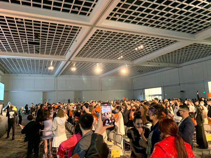
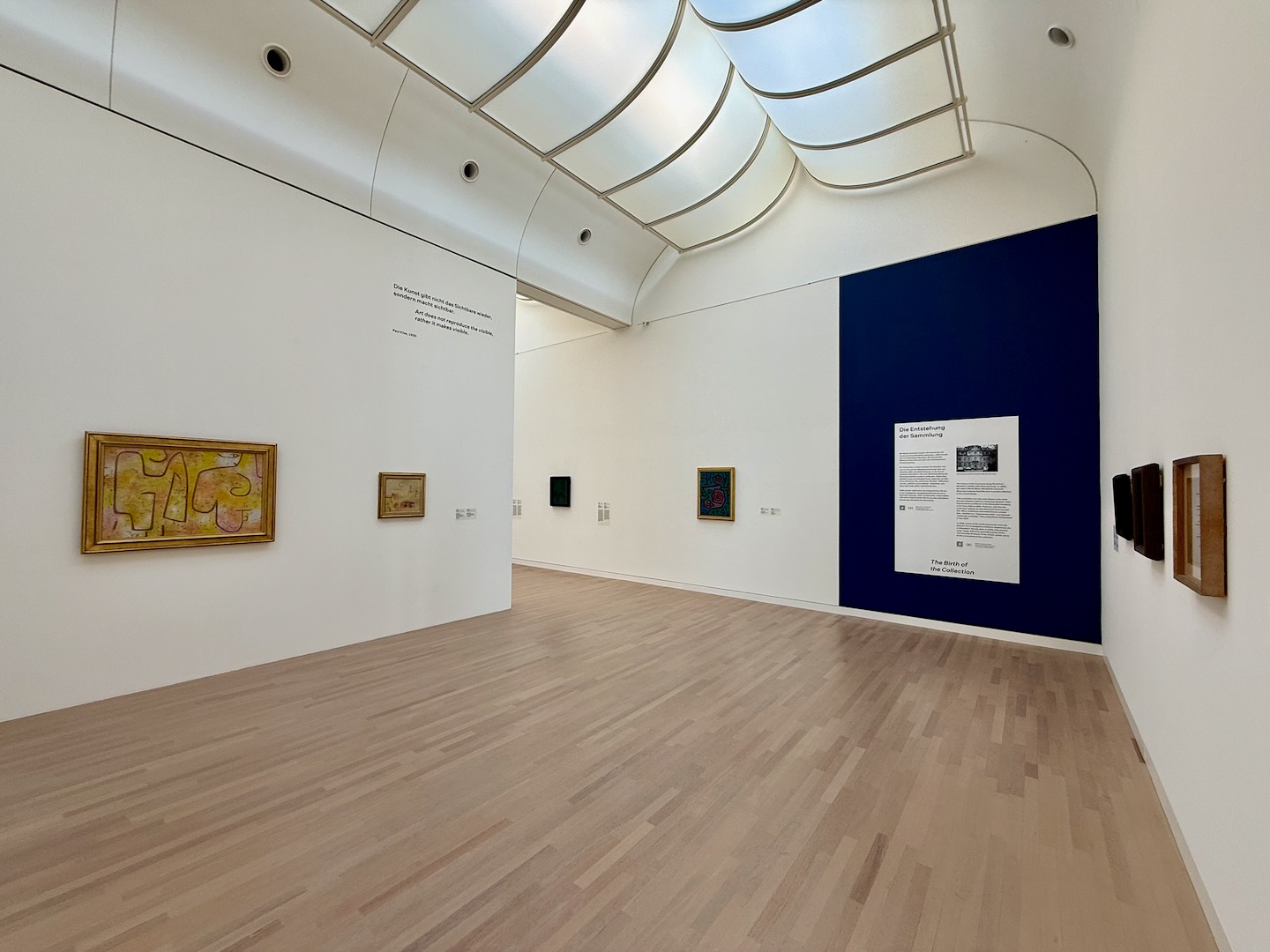
The overall experience of being there was just fantastic and as great as I’d hoped it’d be. People were extremely friendly and I made a bunch of new friends from across northern Europe. I found myself hanging out with a different group of attendees each day of the event. I also snuck in a quick trip to the local art museum specifically to check out their Paul Klee collection and it didn’t disappoint.

Paul Klee paintings in K2

The travel time and slow mornings gave me a little time to slow down and think about everything I’ve been doing which was much needed. The conference was celebrating its 15th anniversary which coincidentally lined up with my 15th wedding anniversary and also 15 years having passed since I graduated from design school.

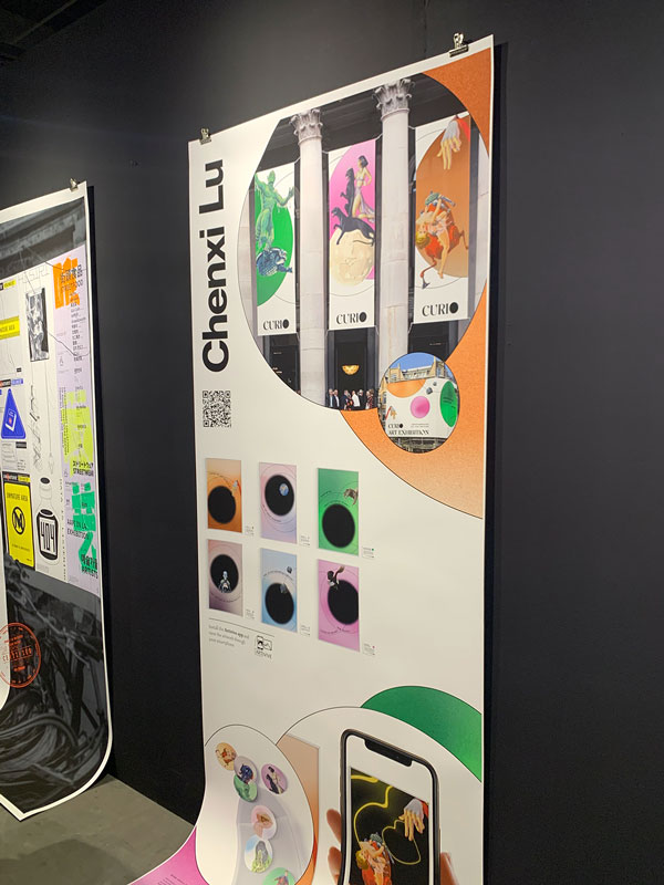
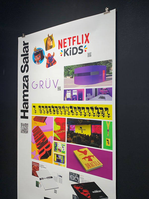
While meeting new people is always the highlight of conferences for a remote worker like myself (I loved the intentional long breaks) the actual conference talks were also quite good and thought provoking.

The 2nd talk of the conference was by Niels Leenheer and I think it was my favorite of the whole conference.

Niels Leenheer on stage

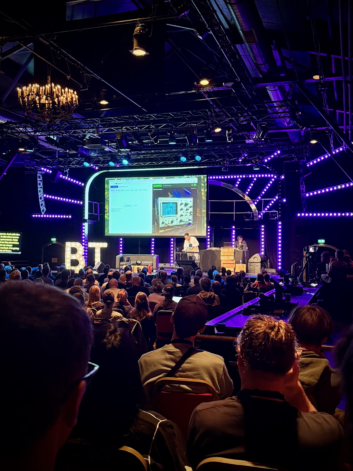
I think after 15 years I’ve started to get, I wouldn’t say bored, but restless from 100% of my work being building UIs for rectangular screens. I’m extremely grateful for the rectangular screens that need software but also I’m itching for something more. I used to do a bit of print work but it’s been 100% screen-based for the last decade now.

Niels talk really fired me up! He was using the web technologies I’m familiar with but using them to literally set off smoke machines on stage and build a crazy part functional and part art installation clock with a Raspberry Pi. I bought my first Raspberry Pi last year and definitely feel more embolded to try more things with it as well as perhaps ordering more things from Amazon solely to take them apart.

Jumping to the end, Lauren Celenza wrapped up the conference and gave a really interesting talk with a lot of big picture thinking about AI. It was really nice to be at a conference where every other sentence wasn’t about AI but I felt like her talk was a good closing and prompted a good conversation over dinner that night with others who have been in the industry for awhile.

As the AI models continue to improve, I think we’re all grappling with the question of where does that leave us who have spent years learning the craft of coding, what work is truly human work, and, for me at least, how can I use these tools to help the independent web win.

On my flight across the ocean home, I re-took Shawn Blanc’s Focus Course. I’d planned on attending an all-day Zoom earlier this year but something came up so I took the 7 hours disconnected from the world to work through the workbook I printed before the trip.

The last time I took it I came up with a verbose focus statement that I did quite (and still do) like but this time I came up with something really short:

“Care deeply and believe in something bigger than myself”

The summarises everything I’m trying to do in my work, my family, my church, and my neighborhood. I don’t think I’m necessarily the kind of person that makes people feel deeply cared for after a conversation but I do really try in all the actions I take to be a person who cares deeply about their impact and doesn’t shallowly check off to-dos not thinking about their implications.

When I got off the train home from the airport, I noticed Philadelphia had fully bloomed in the time I’d been gone. I felt really grateful because for the first time in 15 years I live in a place I have no plans of leaving. Time to dig in. The arc of the spaces we occupy is long and I’m grateful to be here right now.

What Design Students Use To Build Their Website Portfolios

I’ve been teaching labs for students in the ArtCenter Graphic Design degree programs over the last five years to help them build their portfolio websites right before they graduate.

I give a lecture at the beginning of the term where for one of my slides I view source and determine which platform eveyone in the previous term used.

Cargo has been the dominant platform since I graduated in 2011 but I always find the fluctuations interesting so I thought I’d share the numbers from the last two years:

Spring 2025
  1. Cargo (70%)
  2. Squarespace (9%)
  3. No CMS (6%)
  4. Readymag (6%)
  5. Webflow (4%)
  6. Wix (2%)
  7. Adobe Portfolio (2%)
  8. Framer (2%)
Spring 2024
  1. Cargo (46%)
  2. Webflow (38%)
  3. Squarespace (10%)
  4. WordPress (3%)
  5. Adobe Portfolio (3%)

Adding hover states to Cargo Thumbnail Indexes using CSS

Introduction

One of the most common requests I get from students in my Portfolio & Career Prep lab at ArtCenter is how to add hover states to Thumbnail Indexes in Cargo.

Designers want to be able to display the project title and sometimes the tags over the thumbnail image and / or replace the thumbnail with an animated GIF.

Let’s walk through how to do this with some simple CSS!

If you’re more of a visual person, check out the walkthrough on YouTube below below and grab the final code from GitHub.

Setting Up the Cargo Site

I started fresh and created a brand new Cargo 3 website using the C973 template and added some images from Unsplash as the project thumbnails. Then I checked the “Show Title” option on the Thumbnail Index.

Show Title checkbox

In Cargo there are two different places you can add your own CSS. You can either use the sitewide CSS editor, which will apply your styles across the entire website, or you can use the page-specific CSS editor, which will only target the current page.

I’ll be working in the page-specific CSS editor but most of the code can be reused if you want to apply the CSS site wide.

Cargo CSS panel

The [id="1234"] number will be specific to your site. You’ll need to prepend all your CSS declarations with this (but only to keep the code scoped to your homepage thumbnail index). Watch the screenshare to see this in context. I’ll be leaving off the prefix for the rest of the article.

Applying The CSS

Targeting the Thumbnail Elements

First I need to identify the specific CSS classes and elements that make up the thumbnail index layout. By inspecting the page source in the browser’s developer tools, I can see that each thumbnail is wrapped in an element with the class thumbnail and linked. This will be the primary selector in my CSS code.

I’ll start by adding some basic positioning and overflow styles to the container:

.thumbnail.linked {
  position: relative;
  overflow: hidden;
}

Setting position: relative on the thumbnail container will allow me to position child elements absolutely within it. And overflow: hidden will ensure any content that extends beyond the thumbnail dimensions is hidden

If CSS positioning is new to you, I actually recommend checking out Webflow’s video on the topic. Even though the video is specific to Webflow, they do a great job explaining general principles and it’s easy to apply to code.

Styling the Project Title

Next, I’ll target the figcaption element that contains the project title. I want to position this element absolutely within the thumbnail container and position it on top of the thumbnail image.

.thumbnail.linked figcaption {
	position: absolute;
	inset: 0;
	display: flex;
	align-items: flex-end;
	justify-content: space-between;
	color: white;
	padding: 2rem;
	margin-top: 0;
	margin-bottom: 0;
	background: rgba(0,0,0,.2);
	border-radius: 1.5rem;
}

Here’s what each of these styles is doing:

  • position: absolute positions the figcaption element absolutely within the thumbnail container.
  • inset: 0 sets the top, right, bottom, and left offsets to 0, causing the figcaption to fill the entire thumbnail.
  • display: flex and the align-items and justify-content properties position the title and tags vertically and horizontally within the figcaption (see CSS-Tricks for more on Flexbox).
  • color: white sets the text color of the title and tags to white for visibility.
  • padding: 2rem adds some spacing around the text.
  • margin-top: 0 and margin-bottom: 0 remove any default margin on the figcaption.
  • background-color: rgba(0, 0, 0, 0.2) adds a semi-transparent black background behind the text.
  • border-radius: 1.5rem rounds the corners to match the image
Initial layout CSS so far in place

With these styles in place, the project title and tags are now displayed over the thumbnail image. However, they are visible at all times, which may not be the desired effect. Let’s add a hover state to make them only appear on hover.

Adding the Hover State

To make the project title and tags only appear on hover, I’ll set the initial opacity of the figcaption to 0, and then change it to 1 on hover:


.thumbnail.linked figcaption {
  opacity: 0;
  transition: opacity 400ms linear;
}

.thumbnail.linked:hover figcaption {
  opacity: 1;
}

The transition property here adds a smooth 400 millisecond fade animation when the opacity changes. Now, when the user hovers over a thumbnail, the project title and tags will fade in with a nice transition effect.

Replacing the Thumbnail with a Video on Hover

If you want to replace the thumbnail image with an animated GIF video on hover. This can be achieved by targeting the specific thumbnail elements linked to each page and setting a background image for each one.

.thumbnail.linked[href="page-1"] figcaption {
  background-image: url('https://example.com/snoopy-animation.gif');
  background-size: cover;
  background-repeat: no-repeat;
}

.thumbnail.linked[href="page-2"] figcaption {
  background-image: url('https://example.com/another-animation.gif');
  background-size: cover;
  background-repeat: no-repeat;
}

I’m using the href attribute of the thumbnail link to target specific pages. I’ve set the background-image property to the URL of an animated GIF for each page. The background-size: cover and background-repeat: no-repeat styles ensure the GIF fills the entire thumbnail and doesn’t repeat.

Now, when the user hovers over a thumbnail, the project title will fade in and the thumbnail image will be replaced by the animated GIF or video.

Conclusion

Grab the final code from GitHub and give this a try on your site. You might want to add some media queries so this only effects certain screen sizes.

If you have any questions, feel free to leave a comment on YouTube, GitHub, LinkedIn or Bluesky. Happy coding!

ArtCenter Graduation Spring 2022

I’ve been teaching at my alma matter ArtCenter over Zoom since the middle of the pandemic. What started as one class grew into two classes and two labs this past term.

This weekend I made a 36-hour trip out to Los Angeles to congratulate the students in person and meet my nephew who was born two weeks ago.

Graduation banners Graduation crowd

Congratulation to Chenxi Lu, Chang Gao, Tong Li, Hamza Salar + all the rest of the graduating class on all your accomplishments.

Design work by Chango Gao Design work by Chenxi Lu Design work by Hamza Salar

I also snuck in a quick bit of sightseeing too!

Me with Griffith Observatory in the background

Focus Academy Conclusion

The final two weeks of the Focus Course Academy have concluded and I’m really glad that I started off the year by participating in it.

I’ve defined a set of lifestyle practices that I’ll be working to put in place over the next year. The goal of those is to build up some margin in all areas of my life both so I can navigate challenges better as they come as well as be available to jump at opportunities when they present themselves.

My Lifestyle Practices

After a great week 1, for week 2 of the Focus Course Academy we went through a series of excercises that led to the creation of a list of lifestyle practices we will adopt over the next 12 months. These will our first steps towards long-term goals that we also tangibly defined. Here are mine:

  1. Strength train with push ups (3x a week)
  2. Be showered before 7am (daily)
  3. Write down tomorrow’s most important task (5x a week)
  4. Keep screen time average below 2 hours (weekly)
  5. Keep headphone audio exposure below 20% (weekly)
  6. Read a devotion (daily)

This week was challenging but rewarding – putting down on paper how I want numerous key areas of my life to look 1/5/20 years from now was a really worthwhile excercise that forced me to answer some hard questions.

My Life Vision

I’ve been participating in the beta of the virtual Focus Course Academy. The on-demand course had been sitting 10% done on my dashboard for months and the accountability of this cohort has been exactly what I needed to finish the course. I found going through their Plan Your Year workbook in 2019 immensively helpful in contibuting to my success that year.

I’m going to try and post a quick blog at the end of each week of that week’s final homework item for posterity’s sake.

For week 1, we put together our life’s vision after going through a bunch of excercises. Here’s mine:

In my roles as a husband, father, business owner, teacher, and citizen, I want to express, impart and exemplify the values of being adventurous and full of integrity. I will do this by decisively planning experiences that make memories with my family, endlessly learning so I can share new places to see and problems to solve with my children and students, always advocating for the long-term interests of my family, customers, and neighbors, and ruthlessly guarding my time and attention so that I do the things I say I will.

→ Vue.js Documentary

I finally watched the Vue.JS documentary this weekend. I’ve been using Vue since early 2018 but never knew much about its origin story.

It’s an inspiring story about the growth of a truly independent open source project and is definitely worth the 30 minutes if you’re a Vue developer.