→ Joy: The Fight vs The Dance

Jon Foreman:

The “dancing” at SOMA was easy to learn. Throwing my fist in the air with the rest of the pubescent throng, I found that I could fit in just fine.

Needless to say, I loved this article, and the anecdote about the mosh pit at SOMA was just the beginning.

I do so often choose the fight over the dance, I settle too easily for insignificant victory instead of reverberant joy. I find it especially absurd that I do this in marriage, when I know “my wife and I are struggling for the same thing.”

A Response to the Kony 2012 Backlash

Invisible Children’s Kony 2012 campaign has been all over social media since it launched. I’ve also seen a lot of links to a critical response entitled Visible Children as well and felt I should respond to some of the arguments that were put forward.

I would consider myself a lay person on this subject, but I have traveled to LRA affected countries multiple times and have spent hours upon hours researching and following the development of the LRA over the last six years.

While I disagree with the author’s assessment of Invisible Children as a non-profit, I’m going to only write about the arguments he makes against the execution of the LRA Disarmament and Northern Uganda Recovery Act that President Obama signed into law on May 24th, 2010 and IC’s support of the plan of action stated in that bill.

These are the primary statements he makes that I disagree with:

“Both the Ugandan army and Sudan People’s Liberation Army are riddled with accusations of rape and looting, but Invisible Children defends them.”

IC doesn’t defend, deny or even attempt to hide the problems with human rights abuses that exist inside the Uganda government, the UPDF, nor the SPLA. I haven’t extensively researched humans rights abuses in the UPDF, but I have trouble with the idea of one group’s human rights abuses being used as a reason to allow another one’s far greater abuses to go on.

“Kony is no longer active in Uganda and hasn’t been since 2006.”

What country the LRA is residing in is irrelevant. Invisible Children doesn’t claim that Kony needs to be apprehended for the betterment of Ugandans and their most recent project was in DR Congo. IC’s redevelopment focus is centered in Northern Uganda because that’s where the overwhelming majority of those affected by the LRA reside.

“Any effort to capture or kill [Kony] will almost certainly result in many children’s deaths, an impact that needs to be minimized as much as possible. Each attempt brings more retaliation. And yet Invisible Children supports military intervention.”

I can assure you everyone at IC is painfully aware of this reality.

The reasons stated is one of the chief reasons why the LRA Disarmament and Northern Uganda Recovery Act was drafted. The only way to capture Joseph Kony without creating a major threat to the innocent around him is to use sophisticated military intelligence gathering methods to prepare an unpredictable ambush. This is something the UPDF is incapable of doing on their own.

To me, the writer also seems to be implying that IC supported Operation Lightning Thunder in 2008 / 2009. That was never my impression when that operation was going on. A peaceful resolution with Joseph Kony has been pursued exhaustively. The most recent talks collapsed in 2008 in Juba. I remember the heartbreak of all of us who were advocating for peace when it happened.

Kony used the time of peace to regroup his armies and then launched one of his worst offenses in recent memory six months after the Juba talks ended.

Popular support of military intervention has come after every other conceivable option has been attempted without success. Something isn’t always better than nothing, but it is in this situation, I believe it is.

To close, I will point you to a video of U.S. Ambassador to the United Nations, Susan Rice, so eloquently telling MSNBC’s Rachel Maddow why she supports the President sending military advisors.

Adding a Separator to wp_list_categories

In WordPress, if you’re displaying your categories list inline instead of block, odds are you’re going to want to be able to define some HTML to separate the outputted items. Since wp_list_categories doesn’t include a separator argument, you need to do a simple PHP string replace to add one in.

I didn’t see any answers to this question on the WordPress forums so I thought I’d post the code I wrote here.

<?php
$needle = '</a>';
$separator = '<span class="pipe">&nbsp;|&nbsp</span>'; // fill in your separator here 
$cat_list_args = array(
	'echo'  	=> __( 0 ),  // sends output to variable
	'title_li'	=> __( '' ), // removes title of list (optional)
	'hierarchical'	=> __( 0 ), // makes subcategories not show as inner list items (optional) 
	'exclude'	=> __( 1 ), // excludes uncategorized (optional)
);
$cat_list_arr = wp_list_categories( $cat_list_args );
$cat_list_mod = str_replace($needle,$needle.$separator,$cat_list_arr); // switch to $separator.$needle if you want separator inside a tag
echo $cat_list_mod;
?>

On a related note, if you want to hide the separator of your final list item, CSS pseudo-classes makes that super easy.

nav li:last-child .pipe { display: none; }

Interlink Conference

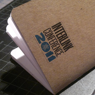
Interlink Conference Logo on SketchbookThis weekend I flew up to Vancouver, BC for Interlink Conference. Normally what goes in my sketch book stays in my sketch book but I thought I’d make an exception and type out some of my notes from the main Friday sessions. I will post links to the videos as they’re released over the next couples of weeks. I hope this post can give people an idea of what was discussed and refresh the memories of those who attended. I apologize in advance to the speakers if these notes don’t encapsulate the greatness of your talks or miss any of your points.

Frank Chimero

Frank gave one of the the best talks I’ve ever heard about the greater meaning and purpose behind what we do. He has been on a hiatus recently to re-discover meaning in his work and part of that has been the creation of his new book The Shape of Design. He shared insightful and heartfelt lessons from his time of discovery.

Near and far – these are the two sides of the design process that we alternate back and forth between. This concept can be seen more specifically in the pairs of how / why, making / thinking and execution / strategy. In web design, these often materialize as markup / structure, responsive / context, SEO / reach and Photoshop / aesthetic.

When looking at this concept in terms of time, it can be broken into three parts:

The Message: this has an infinite length.
The Format: this is the way the message is being communicated right now.
The Tone: this is the matchmaker in the middle.

Design is not problem solving because it’s “answers” aren’t repeatable (like in math). Instead, we create responses to problems.

Frank’s new word, “The Glory Form”: the best possible response from a particular person at a particular point in time.

Culture: a target that if you hit it moves.

Final thought: we are to create designs that are good, valuable and make people’s lives better.

I left Frank’s talk with a renewed excitement to be a creator of things that people see and use that have an impact on their lives. As I do my daily tasks, I need to remember to constantly step back and see how what I am doing is helping to accomplish a larger goal. I want to be conscious of defining what that larger goal (the message of infinite length) is at the beginning of the project so that I can measure it’s success, and most importantly, I want that greater goal to be something I believe makes people’s lives better.

Denise Jacobs

Denise’s talk was a great way to start the day. She discussed tips on how to remain inspired in a lifestyle where our creativity in constantly being tapped out.

Externailize your inspiration – think “what does this design need to be?” instead of “I need to design this.”

Being right keeps us in place.

Inspiration and doing feed off of each other.

Elliot Jay Stocks

The premise of Elliot’s talk was “just because we can, doesn’t mean we should.” He showed numerous examples of websites following trends for the sake of following trends that just create a lot of visual noise. He then began to discuss how we address that.

Constantly asking why is how we break out of trends.

Learning how to educate clients is key for defending your decisions. Thinking about how to defend your decisions makes you make better decisions.

Perceived affordance: what makes a button look clickable.

A fluctuation between web and print design is good for staying inspired.

Recommended video: Tim Brown - “More Perfect Typography”

Whitney Hess

Whitney’s talked laid out a list of ten universal principles of UX design, showing good and bad examples of each in both the real and web world. I definitely recommend checking out her slides to supplement the list below.

UX is the establishment of a philosophy about how to treat people.

Universal experience design principles:

  1. Stay out of people’s way.
  2. Create a hierarchy that matches people’s needs.
  3. Limit distractions.
  4. Provide strong information scent.
  5. Provide signposts and cues.
  6. Provide context.
  7. Use constraints appropriately.
  8. Make actions reversible.
  9. Provide feedback.
  10. Make a good first impression.

The purpose triangle – knowledge, ethics and empathy.

What are your company’s principles?

Sarah Parmenter

Sarah shared resources and lessons learned from her years of experiences as a iPhone application designer, both in the native iOS format and by using web standards (this talk focused on web standards). Her slides included a lot of great tips and resources. Below are a few notes from the beginning of her talk.

ADS: Application Definitoin Statement. To make – list all features and all target users, filter through to make ADS.

Even good ideas can create scope creeps that damage good projects.

Tip for color schemes – overlay primary color 25% over all colors for a more harmonious palette.

Jonathan Snook

Jonathan’s talk was entitled “CSS Takes On The World.” His Work is on the cutting edge of what’s possible with CSS. His talk listed numerous examples of common tasks done usually now with JavaScript that can start to be transitioned into CSS. Some of these include:

  • Drop Down Menus (using CSS Pseudo Classes)
  • FAQs (using CSS Target Pseudo Class)
  • Tabs + Slides
  • Form Validation
  • Animations
  • Better Data Tables (using display:table and flex box)
  • Width Conditionals

Mentioned: jQuery Transitions + jQuery Masonry

Gavin Elliot

“A Better Process”

Gavin began his talk showing a video of a German teenager bashing in his computer. We all laughed. Why? Because we’ve all been there when Photoshop crashes and we forgot to save.

He then talked about a dance we designers know all too well, “The Photoshop Shuffle,” where you spend hours moving things around only to still hate what you’ve made six hours later. Process definitely came up a lot during the day, but Gavin’s talk covered it the most. He showed photographs of his A3 sketchbook as he was working out a layout and user experience. It reminded me of the sketches I did for my PureVolume Mobile project in school and how the Photoshop work on that project came so easily after I worked everything out on paper first.

We don’t design websites, we design systems.

DELI:

Design by Decision
Design by Emotion
Design by Language
Design by Iteration

Simon Collison

“A Dialect of Our Own Design” (slides)

Simon started out going through a brief history of our visual dialect. He used lots of examples of simple shapes in relation to one another and their frame to show how those relationships establish a visual grammar that dictates meaning and perception.

In regards to semiotics:

Symbols are specific and clear.
Icons rely on shared understanding.
Indexes link to an object but don’t depict.

What’s next for the web? The web’s frame of reference is very malleable. Simon showed examples from the fine art world of artists breaking out of the rectangular frame. He then showed examples of specific sites that are pushing the boundaries of what the frame of a web experience is.

Stop thinking in pages. Responsive (or adaptive) design is the new way of showing complex information.

Simon showed a slide of a diagram from an early Macintosh manual explaining how scrolling in the browser worked. It got me pondering that perhaps thinking about the roots of your expectations in interactions is how you can come up with ways to radically change those interactions.


The day ended with a fun night in Gastown enjoying some British Columbia micro-brews with my new-found design nerd friends. On Saturday night the Vancouver Canucks were playing in Game 2 of the Stanley Cup Finals. I met up with one of my friends from Art Center who is a Vancouver local to go watch the game at a pub downtown. The Canucks won in overtime and a 2km long party of 70,000 people in the streets erupted! Here’s a little video clip of the final goal if you missed it. It was an unforgettable end to a great weekend filled with great discussions on design and hanging out with incredible, down-to-earth and passionate people.

Update: All the talks have now been posted up on Interlink Conference’s blog.

Two Big Life Events in Two Weeks

Last month I crossed two big life thresholds in just two weeks – first, graduating from Art Center College of Design and then marrying my beautiful bride Stefanie.

My five years at Art Center were incredibly challenging – in fact, there were multiple times when I thought I wasn’t going to make it; but through God’s faithfulness and the patient and tireless love and support of my family, I did. Looking back, I saw each challenge shape me into the person I am today and I’m proud to be an alumni of the school.

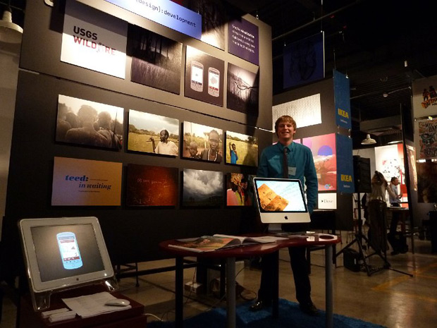
Below is a picture from my grad show, a tradition that all graduates participate in the weekend of graduation. The school opens up to the public and people come from all over to view the student’s work. I’d been to so many shows over the years so it was exciting for it to finally be my time.

Grad Show

Exactly two weeks later, in another whirlwind of a weekend Stefanie and I got married. Stefanie and I started dating 15 months ago and fell in love immediately (read more of our story) and I asked her to marry me in October. We had an amazing time with all our closest friends and family celebrating the beginning of our adventure together as husband and wife (which will be taking us to Grenada in August). Take a look at a few more of our photos on our photographer’s blog.

Wedding

Teed: Portraits of [South] Sudan

Teed: Portraits of [South] Sudan

If you’re in the Pasadena area, my photographic exhibition, Teed: Portraits of [South] Sudan, opened at Art Center College of Design’s South Campus today. It will be up through Friday, April 1st, and the school will be hosting an artist reception this Saturday night, March 26th, from 6pm–9pm. All are welcome and I’d love to see you there!

More photographs, details and directions can be found at on the show’s website.

This is one of the most exciting projects I’ve worked on my whole time at Art Center as its subject matter is a people so close to my heart. Ever since I started at Art Center, I’ve been interested in the work done in conjunction with Designmatters. I had the opportunity to be in the USGS Wildfire sponsored studio they facilitated last term and I’m so grateful for their sponsorship of this project.

Happy New Year from the Paulsons!

Happy New Year from the Paulsons!

My Favorite Albums of 2010

It’s time for the 2nd annual list of my favorite albums of the year. Some of these are from 2009, I don’t get a hold of music as quickly as I used to. Enjoy!

Kevin Max – Cotes d’ Armor

Cotes d' ArmorKevin Max is by far the most talented former member of DC Talk. Over the last decade he’s released albums spanning genres the likes of experimental pop, emotional rock, bluegrass, brit pop, and with Cotes d’ Armor, he jumps into the realms of synth and electronica driven rock. Highlights include the bizarre yet catchy “On Yer Bike!”, the almost humorous apocalyptical “Out of the Wild”, and the deeply emotional “Walking Through Walls” and “Even When It Hurts.” He records a beautiful new version of “Your Beautiful Mind,” a song that balances deep angst and grappling with God with an adoration of Him like few I’ve heard before.

Derek Webb – Feedback

FeedbackThis was by far my favorite album to design to this year. Derek Webb abstractly interprets The Lord’s Prayer instrumentally in three movements. Stylistically, it is the next step along the road from Stockholm Syndrome, balancing a mix of analog and digital instrumentation. The album was further interpreted by a painter, photographer, and filmmaker, creating a contemporary transmedia interpretation of one of the most powerful passages of scripture.

Manchester Orchestra – Mean Everything To Nothing

Mean Everything To NothingAs much as my musical likings have expanded over the years, I still love listening to album likes this. It’s heavy, beautifully written, emotional rock done as good as I’ve ever heard it. Hull spends much of the first half of the album struggling with the fundamentalist culture which he was raised in. The album opens with Hull saying “I am the only son of a pastor I know who does the things I do, but if it was you I don´t think that it would matter.” The album moves to Hull sharing how he found meaning by loving someone who “means everything to nobody” but him and the album’s most powerful track, “The River” ends with Hull borrowing from the hymn, “Come Thou Fount of Every Blessing” and screaming “Oh God I need it, well I was wrong again, take me to the river, and make me clean again.” It’s an album that’s certainly rough around the edges, but a beautiful divine relationship shows through in the end.

Passion Pit – Manners

Manners

This album goes down sweet and smooth like a bag of Skittles. Passion Pit’s wonderful unique blend of warm guitars and synths overlaid with Angelako’s falsetto vocals is a joy to listen to. Every track brings a unique variant on their sound. I saw them play live in September, and I was pleased in how well they sound live, reinforcing how much talent these guys from Massachusetts have.

Lights – The Listening

The ListeningI make a lot of late night drives, and this was my favorite album to keep me company. Lights plays synth pop, but the kind that is rooted in a song that holds it own with just her and a guitar (proof). The album is mature yet charming, filled with meaningful lyrics and creative synth lines and programming. Oh, and she likes The Chariot too.

Honorable Mentions

Imogen Heap - Ellipse
Vampire Weekend - Contra
Deas Vail - Birds & Cages
Tyrone Wells - Metal & Wood
Starfield - The Saving One